You and your team just had a great brainstorming session about your next product, and now you have 300 sticky notes on the board that need to be turned into actionable information. The creatives on the team want to see the information visually, but the analytical thinkers prefer a table to keep things organized. So what happens next?
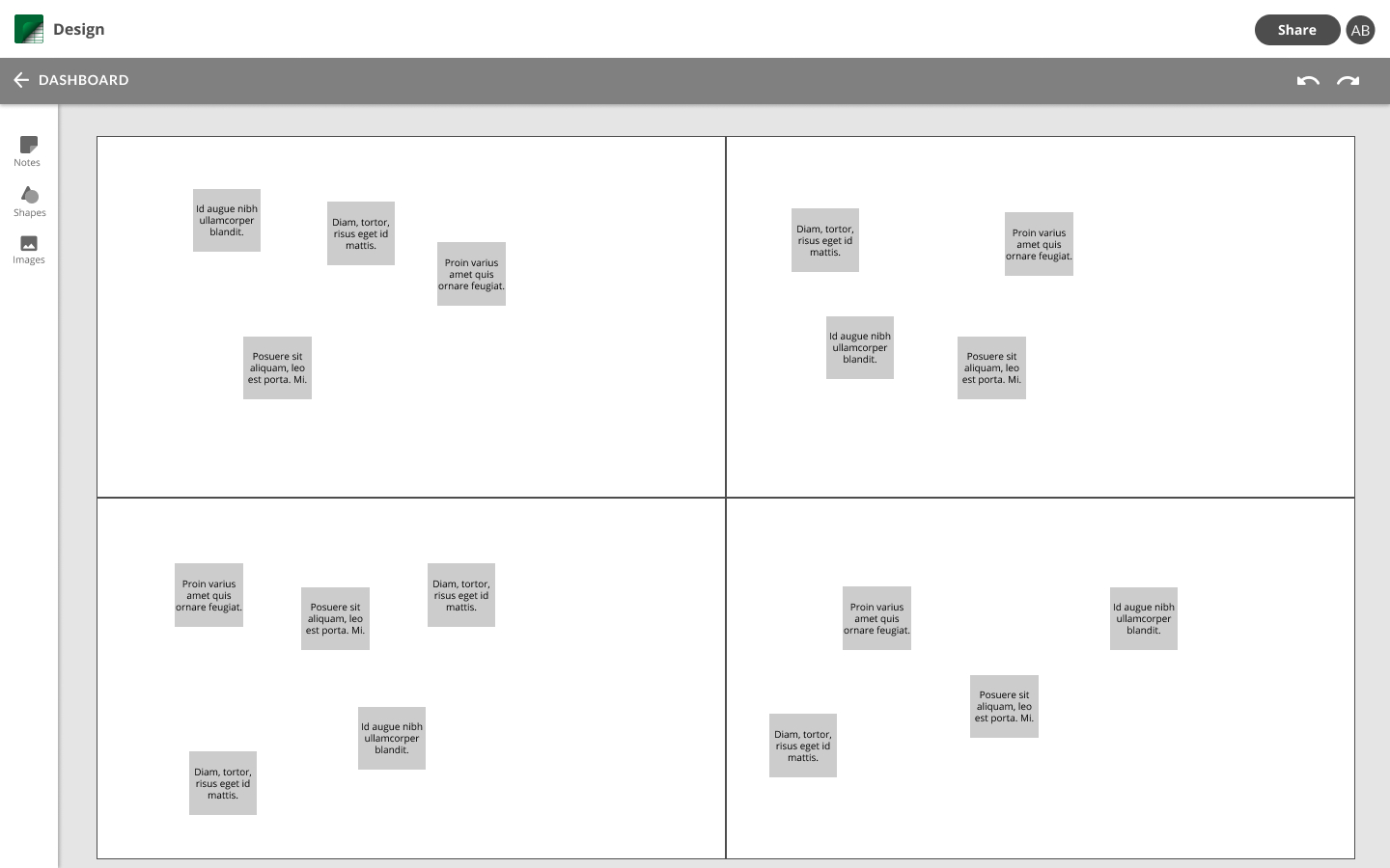
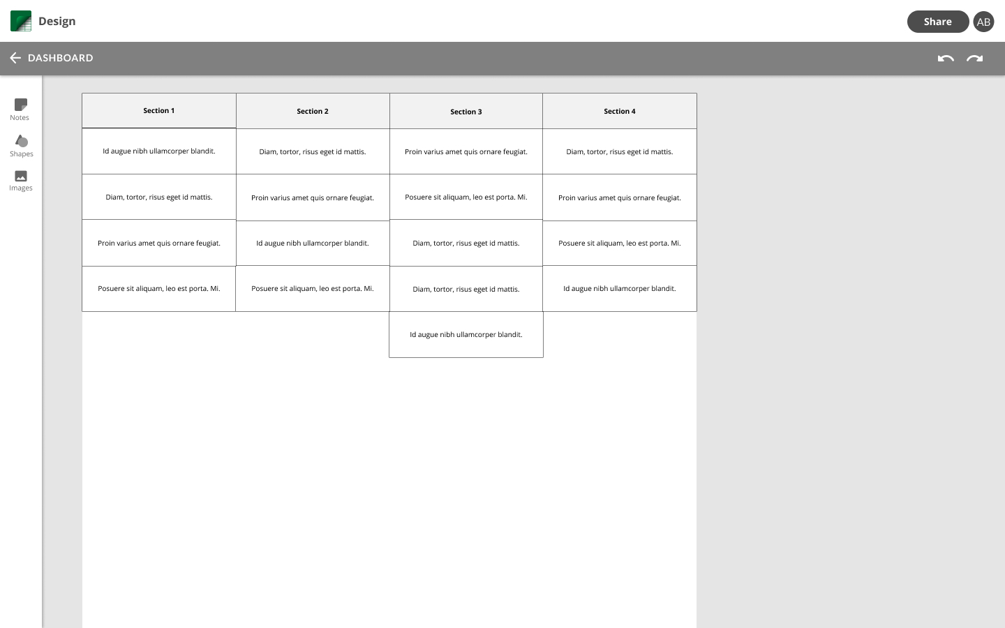
CanvasGT combines the best of both worlds. A virtual sticky note instantly becomes a cell in a table and vice versa, opening the door for creative and collaborative freedom. Keeping your information in one tool reduces the chance that information will be misrepresented or lost, and creates a north star for the whole team to use.
We're bringing this concept to the medical device design industry to help innovation teams go from initial idea to device compliance faster. Design history that proves a medical device design meets the original needs is required by the FDA and can take months to complete, and is often reverse-engineered.
With CanvasGT, teams can connect device concepts back to user needs as they go, saving time and frustration throughout the process.
Medical device design teams are spending valuable time and resources reverse-engineering design history at the end of the design process.
A tool that combines a board and table interface so teams can effortlessly build design history from the moment they start identifying unmet user needs.
Product Design & Management • Branding
Figma • Adobe Creative Suite
User Stories + Flows • Wireframes • Usability Tests + User Interviews • High Fidelity Mockups • Clickable Prototypes • Brand Assets
After identifying the problem, interviews with professionals in the industry further illuminated the gap to be filled regarding design history. In every story, we heard that there was frustration switching between tools and keeping information updated between versions. We learned the most important thing for medical professionals was to make connections between pieces of information to keep track of traceability.
“I don’t want to be spending my time filling in tables. I want to be engaging the world in getting things done.”
- Director of Engineering, Medical Device Manufacturer
“For a NewCo that didn’t start design controls early in the process, that could be a 3-month or longer project to reverse engineer traceability.”
- Managing Director, Research Partnership Program
The tools that exist to help medical device design professionals work well for certain phases of the design process, but not the entire process. In every case, teams were building their design history manually by looking back at information captured in several tools along the way.
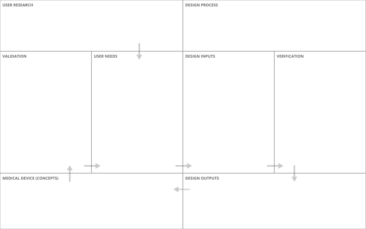
A typical (simplified) design process for our interviewees looks like this:
- Brainstorm to capture information
- Sort information into user needs, design inputs, and design outputs using the Waterfall process (see diagram below)
- Connect final device concepts with a path back to user needs

Interviewees that used traditional physical whiteboards for their brainstorming process dreaded the time when their sticky notes had to be typed into a spreadsheet for design history documentation. Those that used a virtual whiteboarding tool without the capability to export text also experienced this problem.
All of the interviewees expressed frustration about going back to the beginning of the process to recall what users said during discovery or what exactly brought them to a certain conclusion. When those details are lost, it becomes difficult to connect the final device back to specific needs.
The tools used by professionals in the industry each have different and specific purposes, focused on one part of the design process. Each competitor does a great job in their space, but none of them enable users to go through the entire design process in one place. The key features of CanvasGT to combat this problem are:
• Multiple information views - both visual and analytical
• Realtime updates and collaboration
• The ability to create connections between pieces of information
Armed with this information, we set out to define the project scope and strategy. We evaluated the many possible components and features based on how important they were to the users, how satisfied users are with their current tools, and the level of difficulty to build. We categorized needs into three product phases, or versions: demoable, MVP, and commercial.
Starting with the demoable version, we determined the most important things a user needs to do is (1) create a virtual whiteboard, (2) see that information in a table view, and (3) connect pieces of information to trace from the end product back to user needs at any point in the process.

Basic sketches of the most important pages were created to visualize the overall architecture of the app, then more detailed versions were created digitally as wireframes.
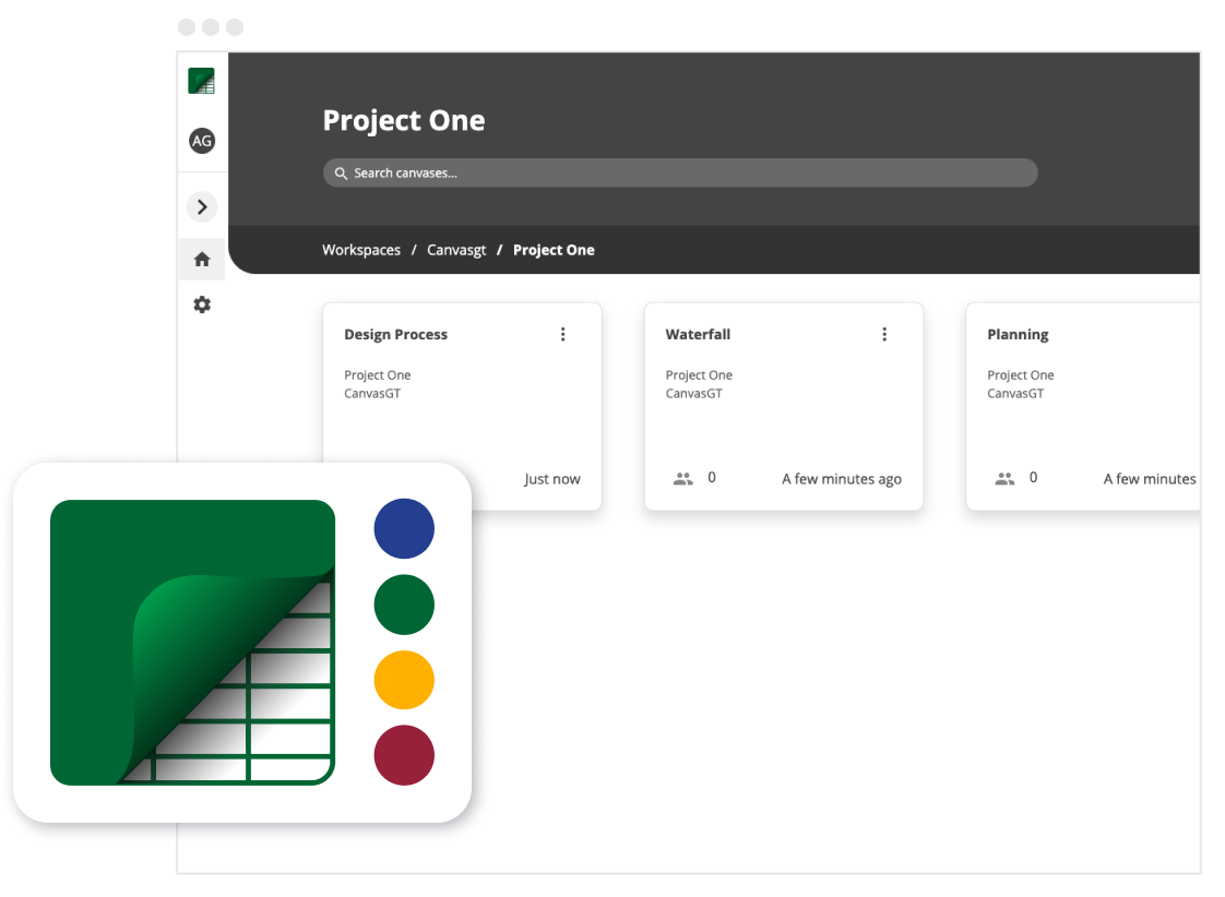
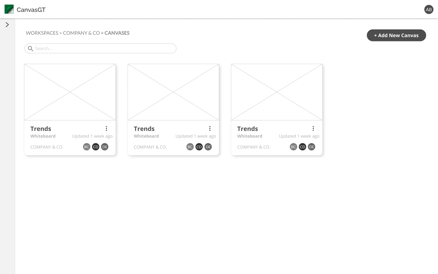
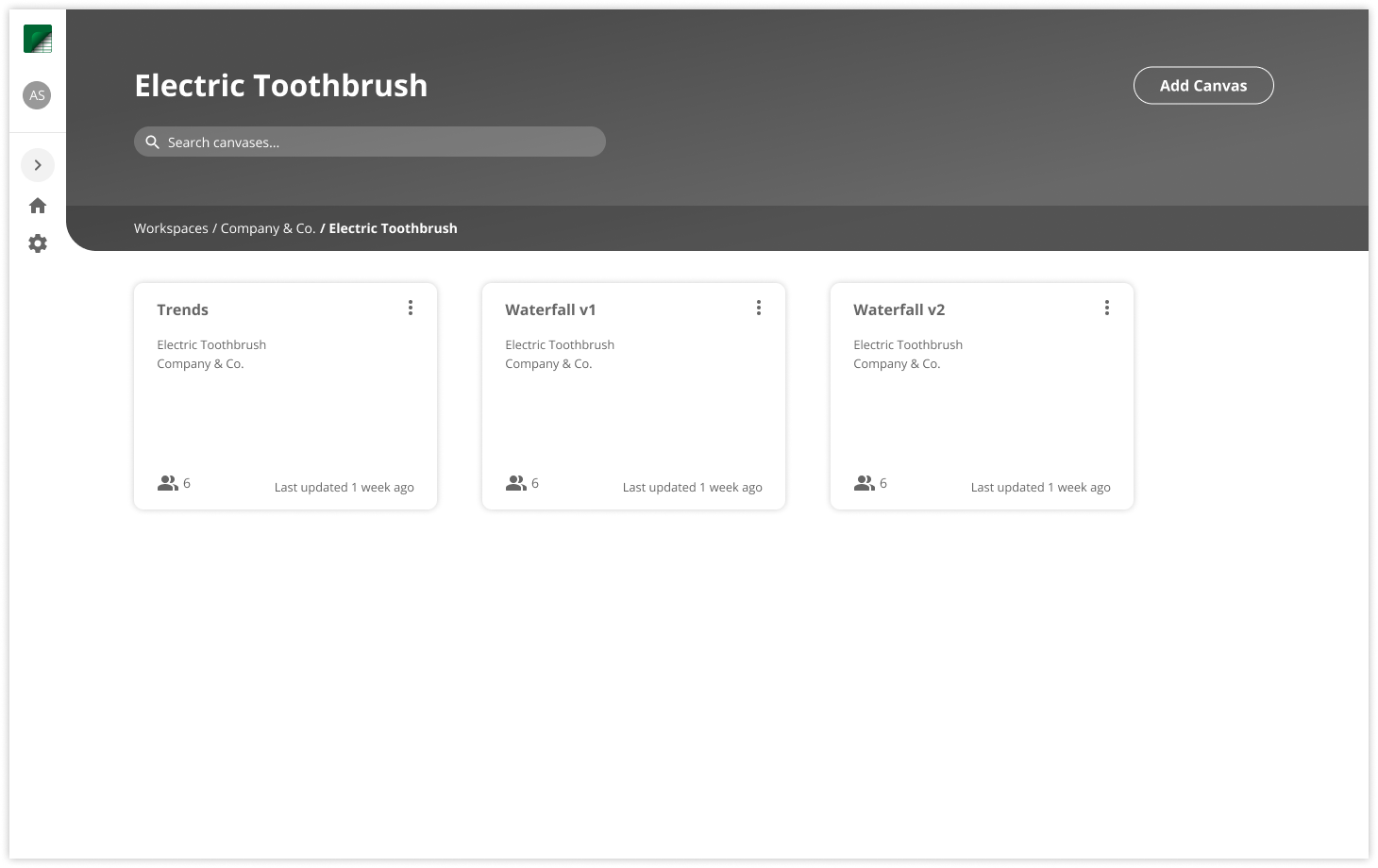
From the dashboard, users can access their canvases, which contain boards and tables.
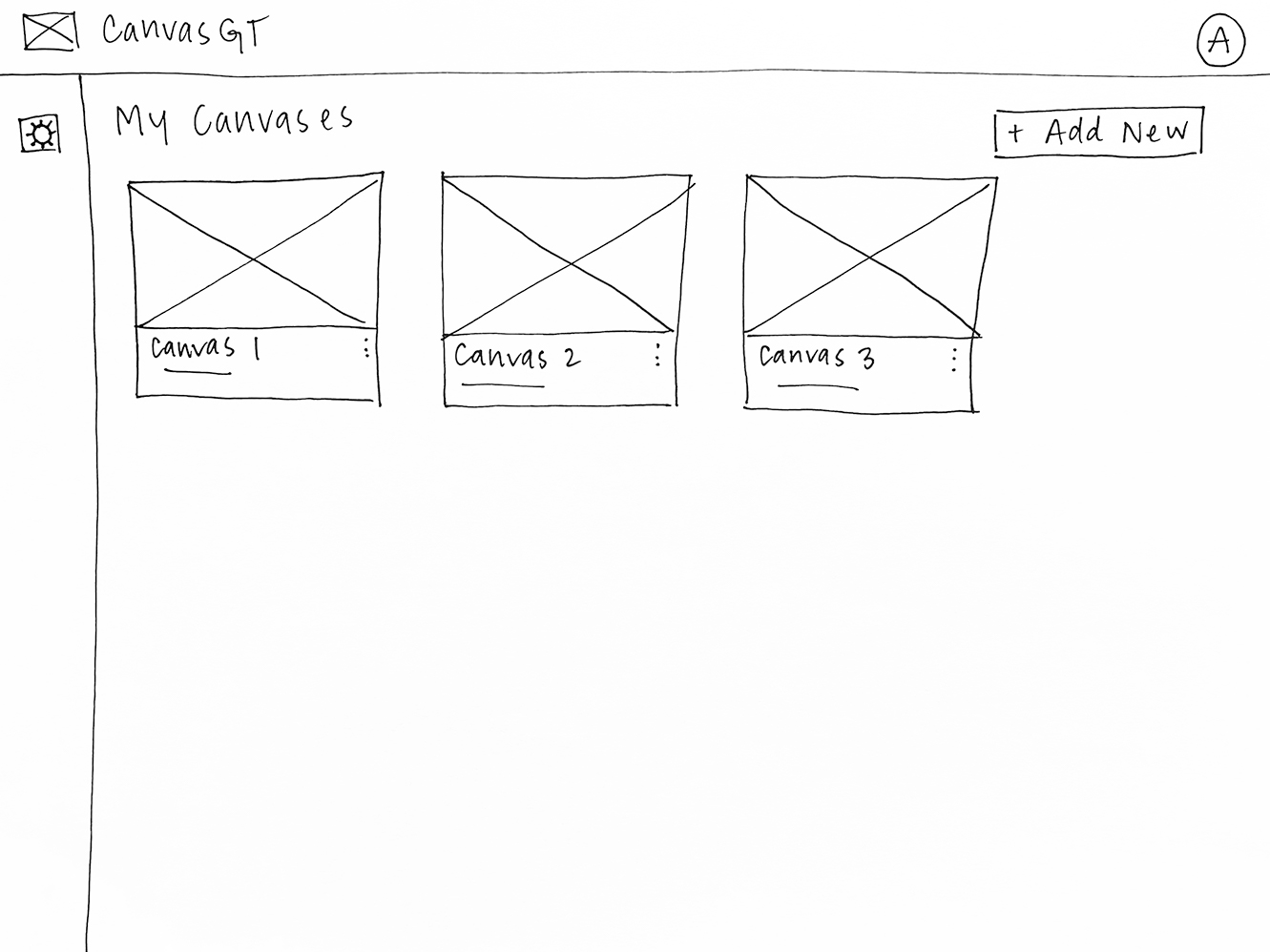
We used low fidelity wireframes to explore the way a user would interact with each screen.
We used the first round of testing to better understand how the user might want to interact with these pages and what they would expect to see when asked to find a certain feature.
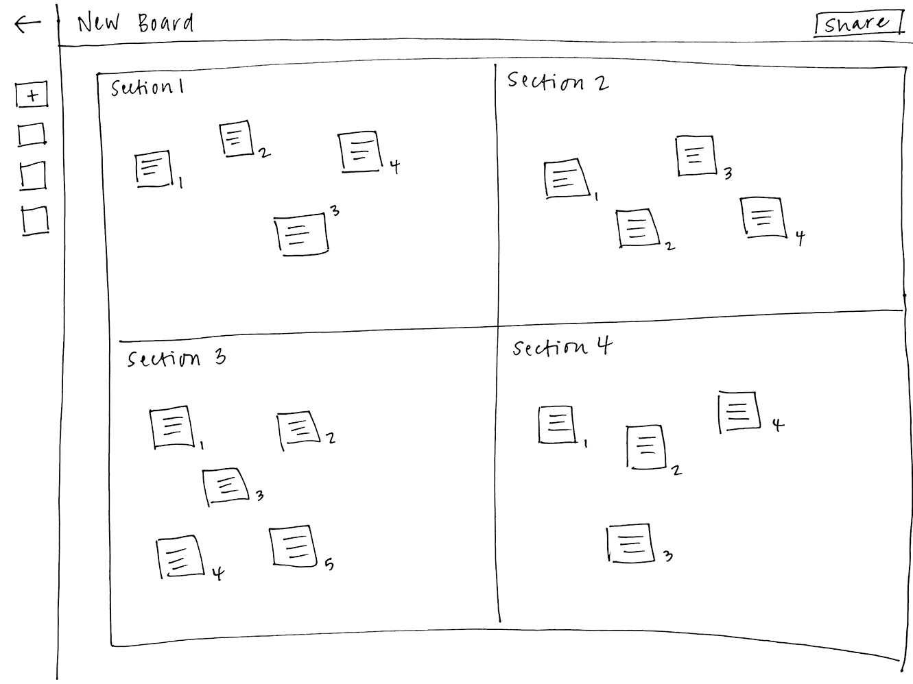
This version did not include a specific button for making connections on the board or canvas on purpose. We wanted to ask what users would expect to happen and how they would want to accomplish this. Users thought an arrow might appear if they hovered over the note, or expected a special mode where they could make those connections. Several users mentioned that they sometimes have hundreds of notes, and that it might be hard to see notes once they started connecting things and making lines across the board.
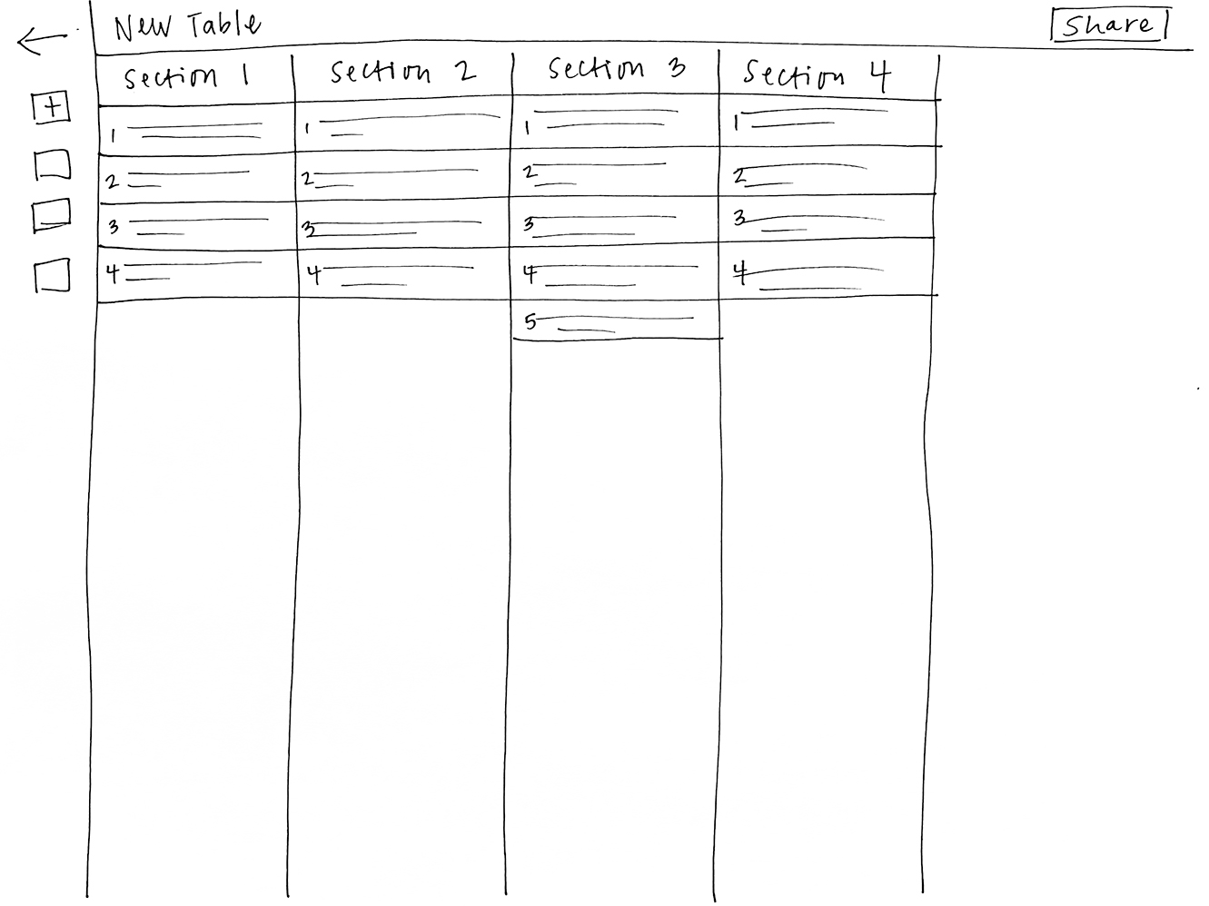
Because of the low fidelity, some users had trouble understanding how the notes on the board related to the cells in the table.
This information gave us a few problems to solve for. We needed to create an organized and intuitive way for users to connect notes, with options to view or turn off those connections. We also needed to make it obvious which information is related on the board and table.
After a few more rounds of usability testing, we decided to focus on one particular framework, the Waterfall model, before moving forward with multiple templates so our users can tell us what they need. Our founder developed this framework as a visual tool in his former career in biomedical engineering, and is a strong starting point for the capabilities of this tool.
With some of the largest issues brought to light, we started working on a visual design direction. Since this is our first product, we had a lot of opportunity to try out different directions and see which one most aligned with our start-up's new brand. These hi-fi designs were turned into clickable prototypes so we could continue to test what it's like to interact with our tool.
The CanvasGT brand was inspired by a grand tourer sports car - a car that combines the performance of a sports car and the comfort of a long-distance driver. Our use of bold color through the navigation is a reflection of the power of sports cars, and the clean and simple palette on the board and table reflects the "old reliable" long-distance driver - and allows for maximum creativity without distraction.
The canvas dashboard has been refined and polished, allowing users to efficiently access their information and manipulate canvas data.
The board view has gone through simple revisions, updating the header to allow all navigation tools to live inside it and removing unnecessary design for the sake of design.
The table view has been updated to appear as an integrated part of the screen instead of a floating table, making it more familiar and allowing for more information to be seen at once. Green checks on each line were added to indicate to users when there are completed connections.
With the visual design in place, our developers got to work building our tool.
We've landed on our demoable version, and we continue to test it with new potential users regularly. As we learn more, we're making note of urgent fixes and nice-to-have features that can be implemented in future versions.
Stay tuned for updates as we make our way to a commercial product!
I'd be happy to show you around! Just shoot me an email to set up a time.
Email me