Case Study • 10 min read
A cloud storage aggregator designed to simplify finding your cloud documents when you need them, no matter where they are saved

If you’re like me, you probably also use Google Drive, Dropbox, Evernote, Pocket, and iCloud, and maybe OneDrive, Pinterest, or a number of others on the market.
Many of us use each one for a different purpose, and we’ve accepted that they must all live separately. We’ve gotten used to having 12 tabs open in our browser or swiping through multiple home screens on our phone, then searching through 3 platforms before we find what we’re looking for.
But it doesn’t have to be that way. Wouldn’t it be a dream to have them all in one place? One tab on your browser, one app on your phone? One cloud drive to rule them all?
That’s where Cirrus comes in. Welcome to cloud nirvana.
With so many cloud storage platforms on the market, cloud storage users are frustrated when they have to navigate between several cloud drives to find the file they are looking for.
Cirrus brings all of a user’s cloud drives into one easy to access location. The user can search across all drives, upload files to a specific drive, share files, and edit files in the native platform, removing the need to navigate back and forth between drives.
Research • Branding • Visual Design • User Testing
Sketch • InVision • Adobe Creative Suite • Google Forms
User Survey • Competitive Analysis • Personas • User Stories + Flows • Wireframes • Usability Tests • High Fidelity Mockups • Clickable Prototypes • Brand Assets + Style Guide
This client was looking to break into the cloud storage market. But with so many big players in the game, they knew that recreating the wheel wouldn’t be the right approach. After completing user research, a new problem came to light: users wish they could connect their existing cloud platforms.
Of cloud storage users managed 4 or more cloud storage platforms
Users wished they could have easier connectivity between their cloud storage platforms
The majority of current cloud storage users had 4 or more different cloud drives each. Their most used platform was Google Drive, followed by Dropbox and iCloud.
The majority (94%) of these users rely on both mobile devices and laptop computers to access their storage.
Users prioritized saving and uploading files, sharing content with others, editing files, and saving links or web content as the most important tasks.
30% of respondents wanted to connect existing cloud platforms so all user files would be easy to access from one place.
The majority (53%) of respondents said they would be likely or very likely to use a cloud aggregator.

After evaluating the strengths and weaknesses of other popular cloud drives, the path to success in this market will require these important features:
• A way to search through files on all connected drives
• Access to create, view, edit, and organize files within the platform
• A way to easily save links, photos, and videos from the web
• Web and mobile apps

Personal User
Travel Writer • Age 29
Los Angeles, CA
#1 Frustration
Switching back and forth between her cloud based storage apps.
#1 Goal
To have a central place to access all her photos, videos, links, and journal entries.
Joanna travels often and enjoys taking personal photos and journaling in addition to writing for work.
She uses one cloud storage app to back up her photos, another to do her journaling so she can travel light, and she uses yet another app to save articles and funny videos she finds while she’s waiting for her next train or plane.
She gets frustrated when she has to switch back and forth between apps. Her goal is to have a central place to access all the photos, videos, journal entries and links she saves.

Work/School User
Project Manager • Age 32
Chicago, IL
#1 Frustration
Navigating between all of the different cloud storage apps used by his clients.
#1 Goal
To have an easy way to find and share files on multiple platforms.
Timothy is in charge of receiving and distributing materials to clients on behalf of his team.
He finds that he and his clients seem to always be using different cloud storage platforms to share materials. Because of this, he has several cloud drives open on his computer at the same time, and finds it frustrating to navigate back and forth to remember where a client sent a file.
His goal is to have an easy way to find and share files while letting everyone continue to use the platform that works best for them.
The information gathered about our users and potential competitors allowed me to start getting specific about what the user will want to do and how they will be able to do it. This information was organized into user stories and flows, then translated into the initial wireframes. Before going any further, I completed usability testing on the wireframes so any big changes wouldn’t affect the visual design.
Keeping the target audience in mind, user stories were developed to represent the most important tasks a user would want to complete with this solution. The chosen tasks include two high priority tasks (viewing all cloud files and uploading files/folders) and one medium priority task (organizing files). This allowed for many of the other user stories to be woven into the user flows that followed.
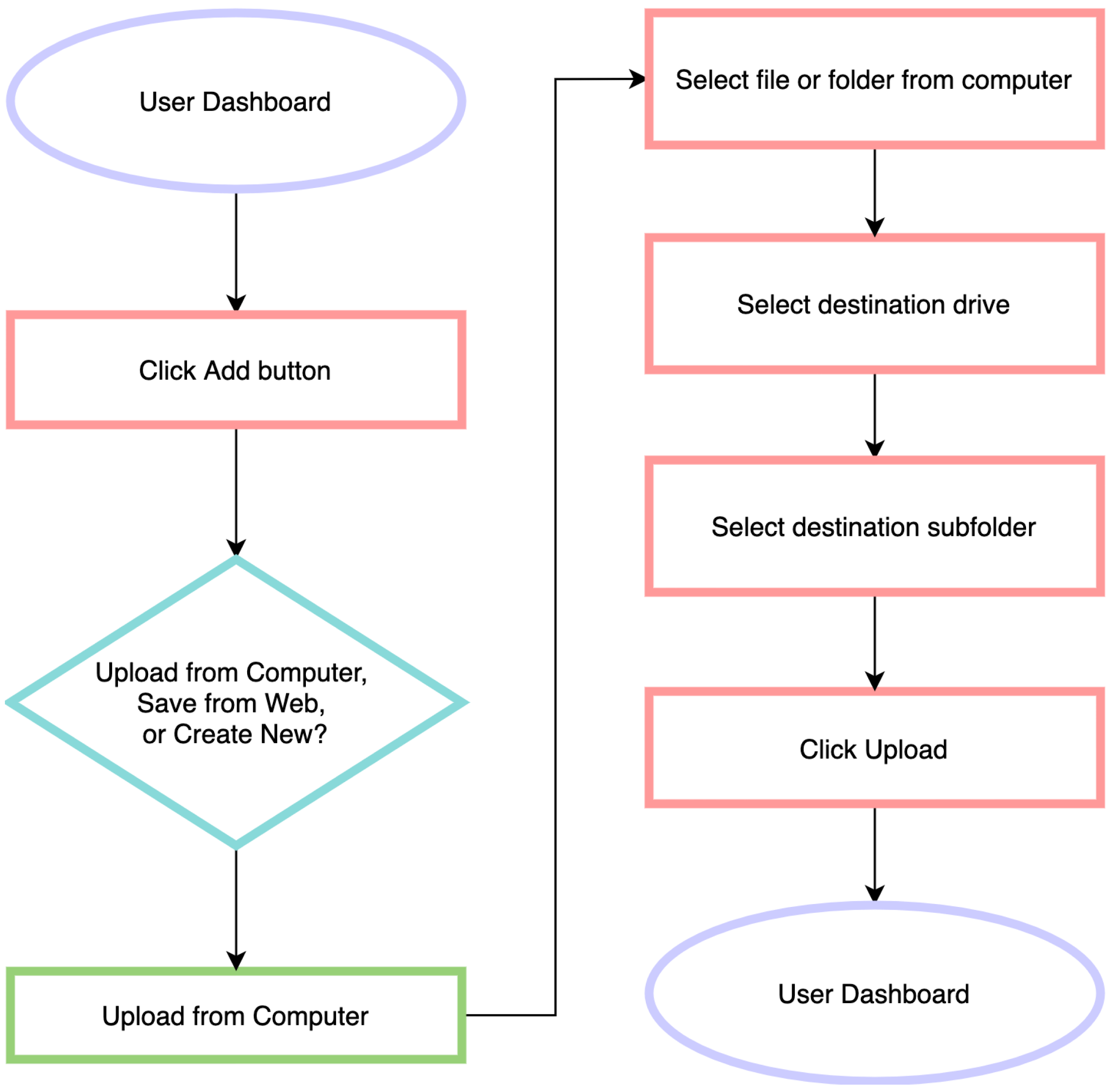

I started by sketching the most important user flows in their most basic form. Those sketches were then turned into more detailed wireframes.
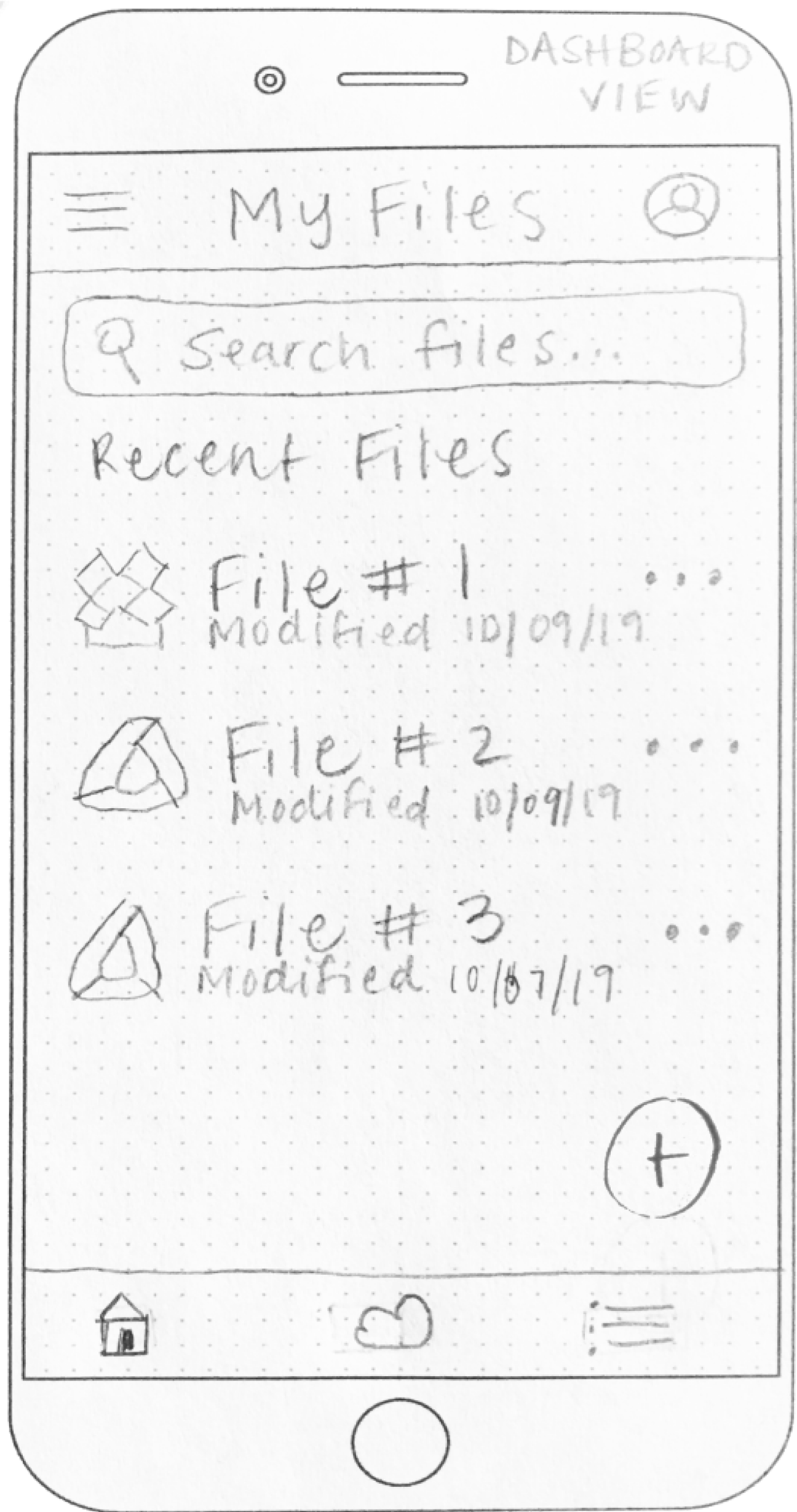


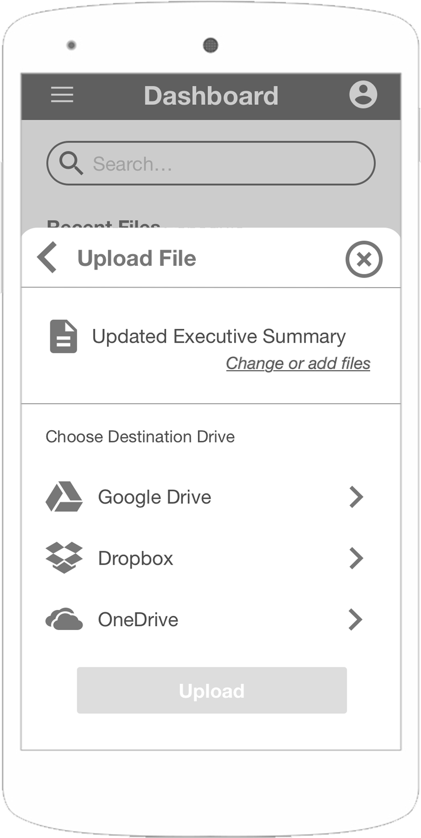

A clickable prototype was created from the digital wireframes, and tested with users before going too far down any design path. Users were given three tasks to complete: creating an account, uploading a file, and organizing that file into a different folder.
This round of testing helped me realize that because some of the users weren’t familiar with cloud storage apps, they also weren’t familiar with common design patterns used such as the Material Design Floating Action Button (FAB).
After this feedback, I was able to rethink components and make them more clear to the users in the next iteration.
Mobile + Desktop:
1. Make instructions more clear when choosing a location to save the uploaded file
2. Add a way to see connected drives on dashboard
Desktop:
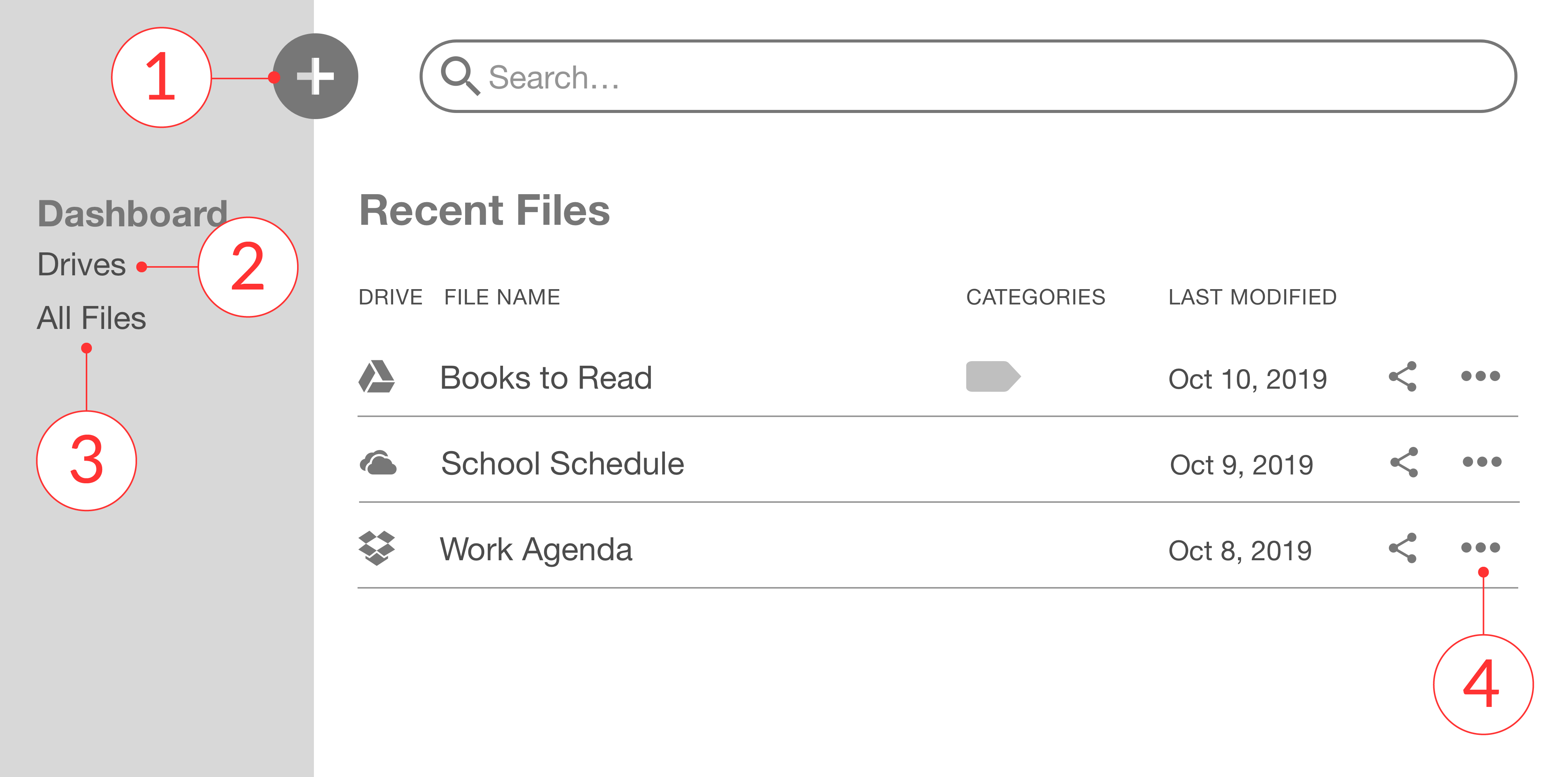
1. Define locations in the sidebar more clearly - add location indicator
2. Move Add New button into the sidebar and add a text label
3. Change tridot menu to an “Options” button for clarity
Mobile:
1. Change the bottom navigation bar on mobile to a tab bar for “Dashboard” and “All Files”
Now that the wireframes had been tested and improved, I started exploring branding for the app. The users of this app will be users of multiple cloud drives. They will use it for personal or business use, but in both cases, they are looking for an easy, intuitive experience. I wanted this brand to convey a modern, clean, and friendly atmosphere and make the user feel calm, focused, productive, and efficient.

I started with a moodboard to gather the thoughts and feelings I wanted the brand to evoke.
The name Cirrus was chosen because cirrus clouds are the highest group of clouds, representing the app as an all-encompassing cloud drive aggregator.
The brand colors were selected for their meanings: coral for creativity and energy; teal for calmness and focus; lavender for calmness and creativity.

Typography
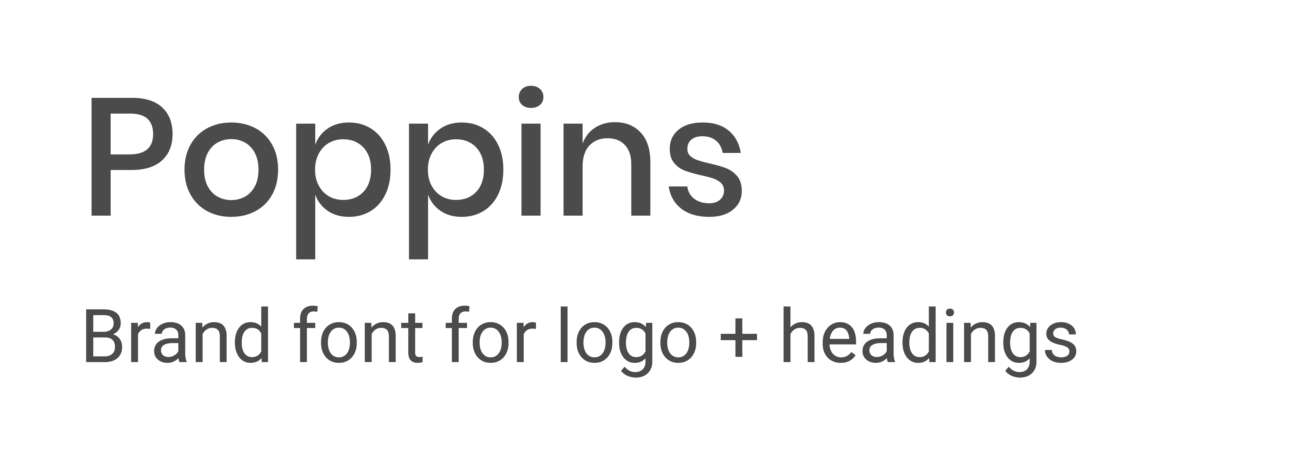

Poppins and Avenir were chosen as the brand typefaces for their fun and friendly, rounded nature.
Logo
I wanted the logo to help represent the way Cirrus connects cloud apps together in a fluid way. A cloud shape was incorporated into the design to help communicate the app's purpose.


With one round of usability testing done and the visual design direction established, it was time to start creating usable prototypes to test the experience design and learn about user preferences.
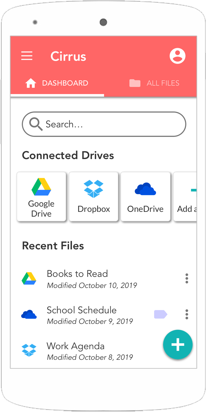
Based on user feedback from prior testing and the brand selections, high fidelity mockups were created. Throughout the process, I implemented changes based on user feedback.
1. Adding a way to access connected drives in the dashboard view removes the need for a bottom navigation bar and allows for a top tab bar with 2 destinations
2. Version 2’s “+Add” button next to Connected Drives was ambiguous to users - Version 3 includes the button as a part of the Connected Drives section and doesn’t compete with the FAB


Desktop
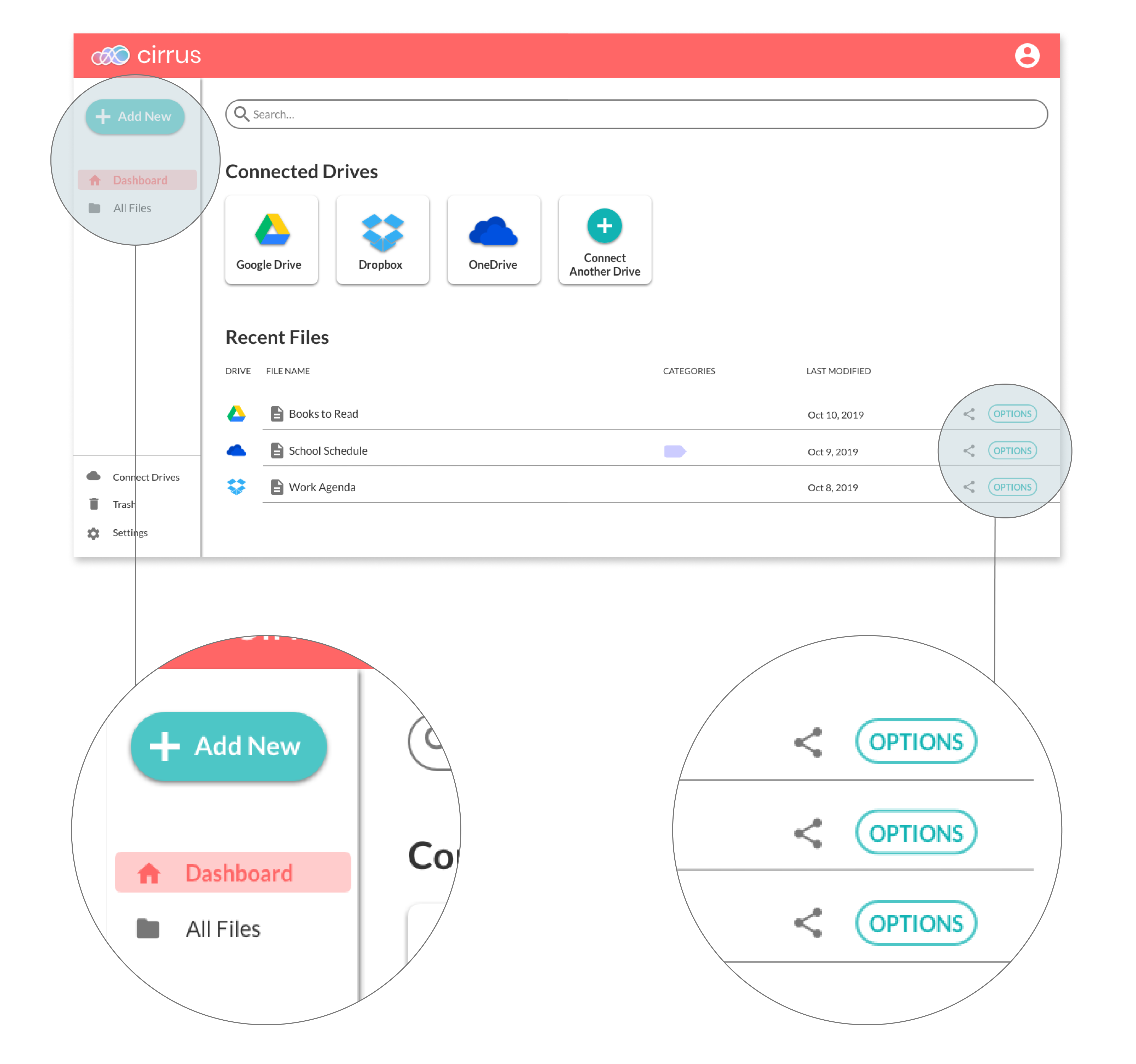
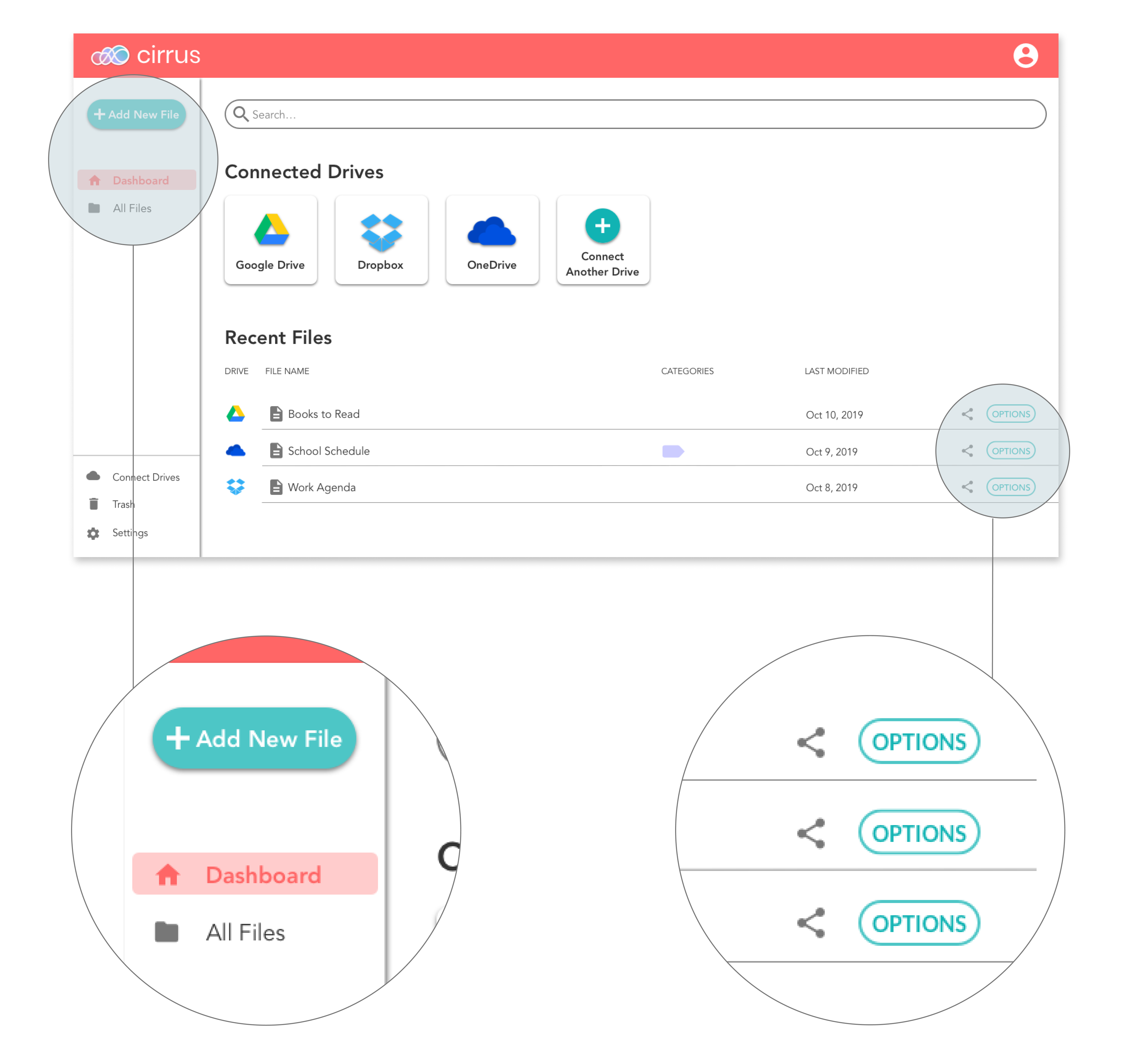
1. Text was added to the FAB button to let the user know what it was for; the button was also moved inside the navigation bar
2. The sidebar on desktop was reorganized to make navigations options more clear
3. Connected Drives section was added to the dashboard view to be consistent with mobile
4. The tridot menu button was changed to a text button called “Options” to remove uncertainty


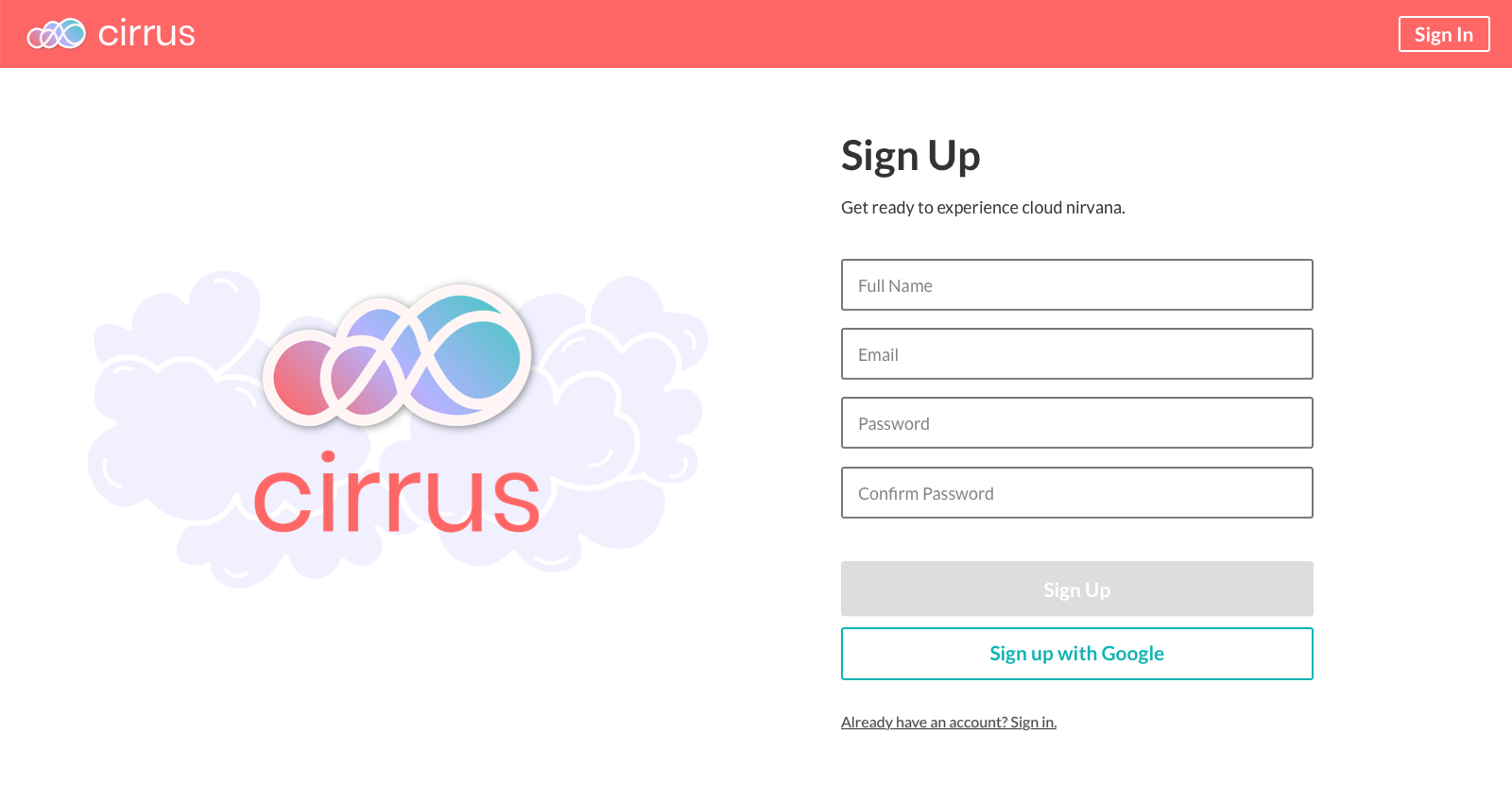
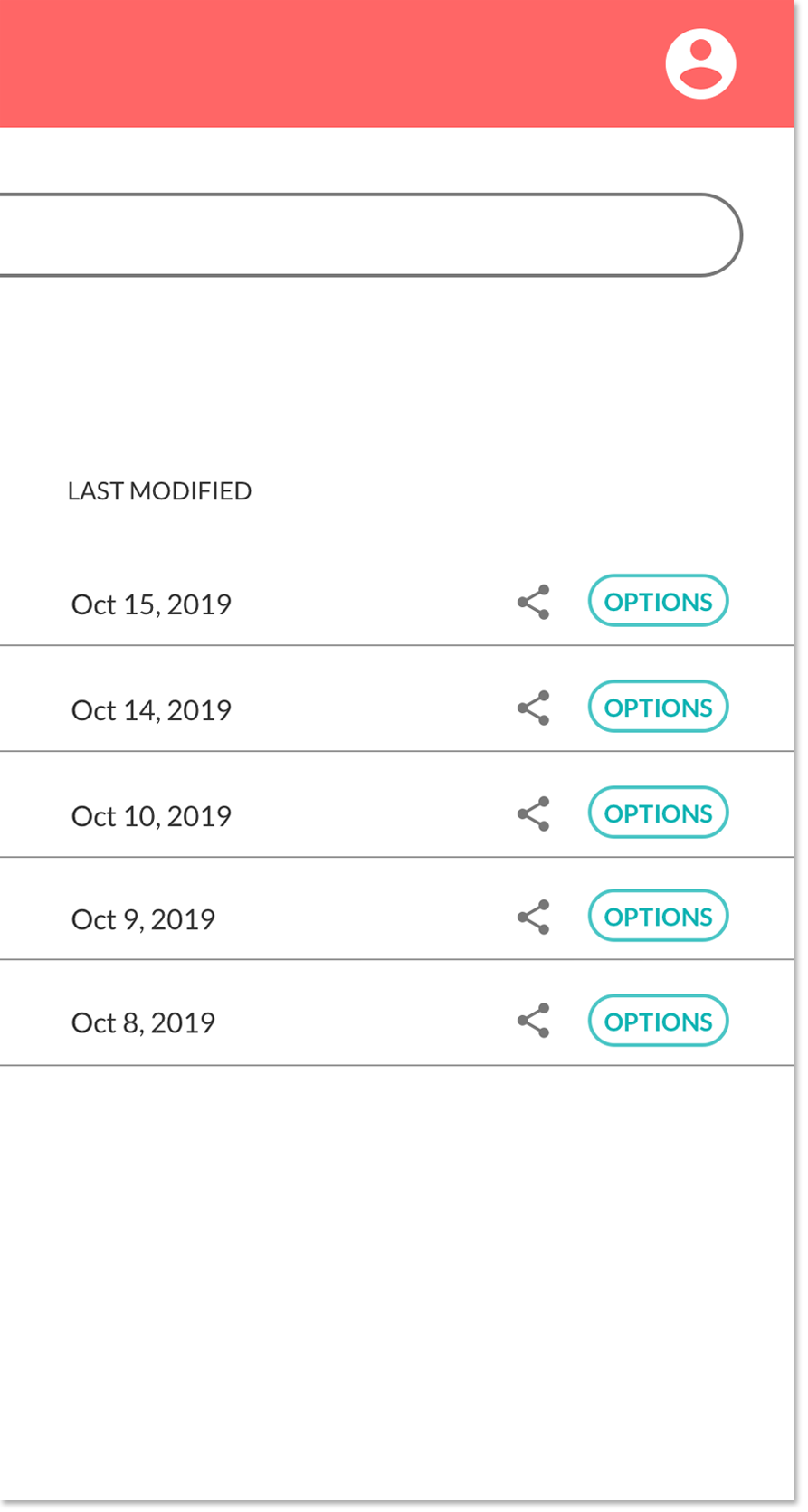
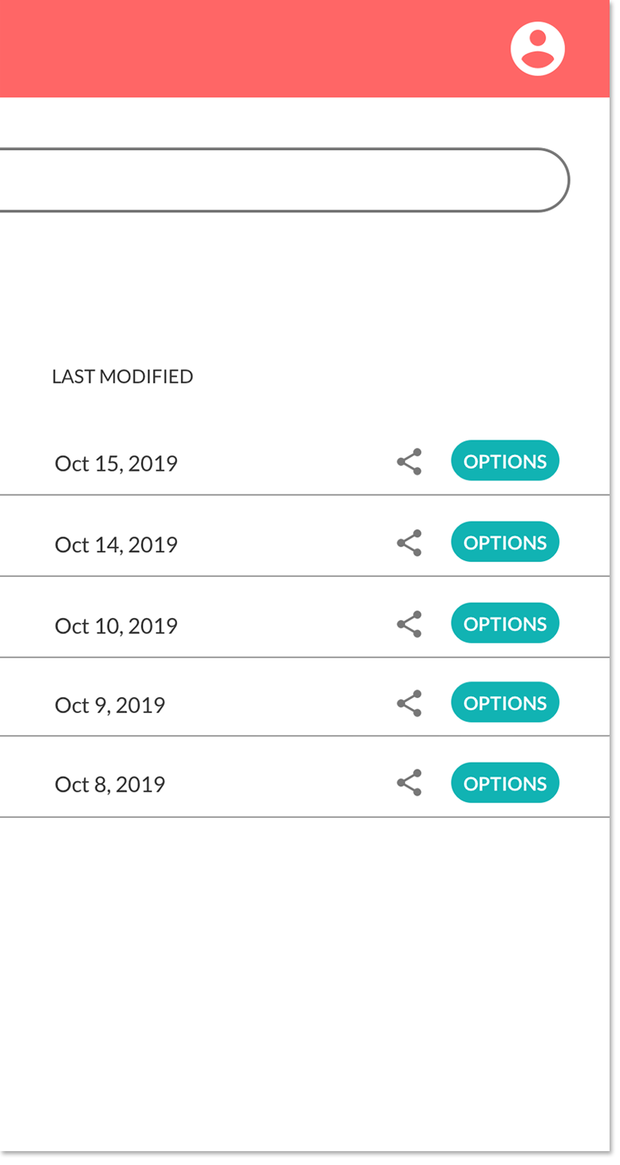
There were some components where I considered multiple designs, so I decided to use preference testing to determine which design elements users liked best.
Users preferred the bright impact of design option 1.

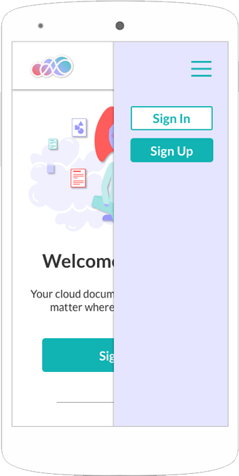
Users preferred having an illustration next to the form in option 1 for a little more visual interest.

Users preferred the outlined button that didn't compete with the importance of the "Add New" button.
Another round of testing helped me learn more and refine the user experience further. The users were given the same three tasks - signing up for an account, uploading a file, and organizing that file - and were able to complete the tasks more easily than the first group. They were also asked questions about the branding of the app - what impressions do you get of the page, what do these colors make you feel, etc.
The color scheme successfully communicated a warm, friendly, clean, and peaceful feeling to these users. The hero image also communicated that this app would help you stay calm and organized.
Asking these branding questions showed me that although the users knew this was a cloud drive app, they didn’t all understand that the app connects all of a user’s cloud drives, letting me know that the copy should be updated to more clearly state the purpose of the app.
There was still some confusion about whether the “Add New” button would add a new file or add a new cloud drive, and another user confused the add button next to Connected Drives on the mobile dashboard (which looking back, was not surprising!). This led me to these conclusions:
Changes to be made:
1. Description on home page should be more direct about being a cloud aggregator - “Cirrus keeps your CLOUD documents at the ready…”
2. Change “Add New” button to say “Add New File”
3. Remove “Add” button next to Connected Drives on mobile, replace with button more similar to connected drives
Creating this app was a really valuable experience. The thing I found most helpful during this process was multiple rounds of testing. Having testers that were not accustomed to using cloud drives turned out to be a big bonus - their experiences highlighted issues I might not have otherwise thought of, and reminded me that even if you’re using common design patterns, you can always make things a little more clear.
If I had additional time to continue this project, I would continue to explore the navigation options and drill down to what is really needed to help the user get where they need to go.
Cirrus solves a big problem for cloud users by offering a way for users to efficiently access all of their files in one place, saving them time and cognitive effort. Users no longer have to ask themselves, “Where did I save that file?” - with Cirrus, it’s simple.