Configurable Notifications
Notifications are essential in the MedTech lifecycle. Notifications tell people when it’s time to review, approve, or take action on key compliance tasks. But there was a long-standing problem in our system - users were absolutely drowning in notifications.
My role: Design Lead, Research Lead
Team: Design + Product Manager + Staff Engineer
The Problem
When reviewing existing feedback, we quickly learned that many customers were getting hundreds of notifications each week - and worse, most were irrelevant. Important alerts were buried in the noise, and users began ignoring them altogether.The situation had become so bad that our own customer service team started telling new clients to disable all notifications during onboarding — just to prevent frustration (red flag!). 🚩
This was a huge opportunity to improve our customers’ quality of life and compliance at the same time.
The Opportunity
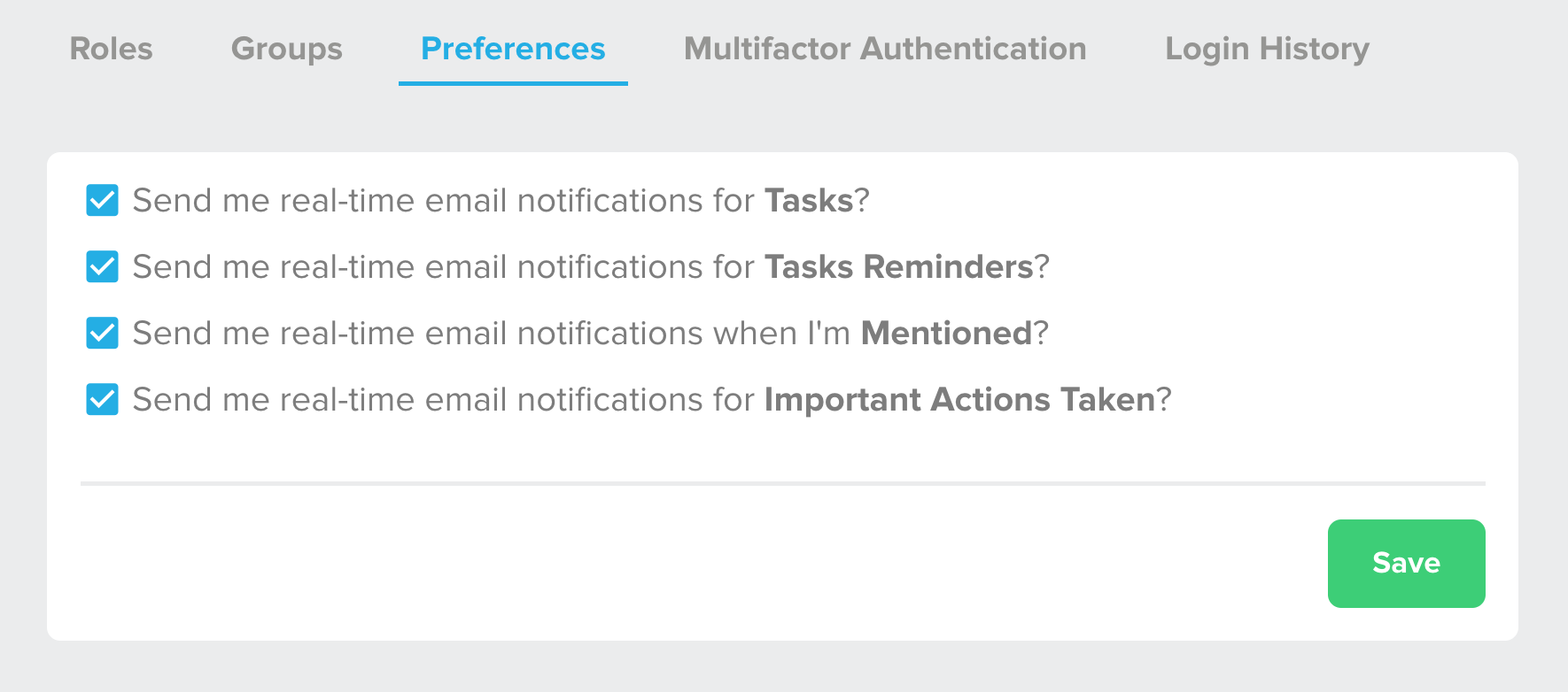
The existing notification system offered almost no flexibility. Users could only choose from four broad categories:
- Tasks
- Task Reminders
- Mentions
- Important Actions Taken
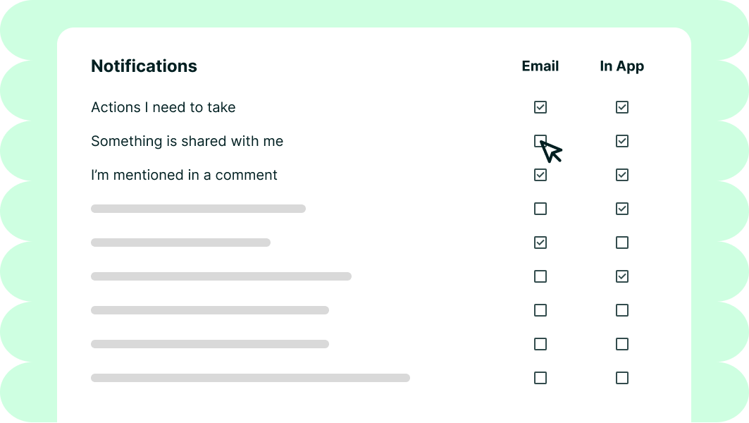
An image of the old notification settings with four categories: Tasks, Task Reminders, Mentions, and Important Actions Taken.
Each category contained dozens of unrelated alerts - more than 100 total across the system.
“Important Actions Taken,” for example, lumped together both actionable items (“You need to approve this document”) and irrelevant updates (“Someone else approved a document”). Users could either receive all of them or none.
To make matters worse, these settings only controlled email notifications. In-app notifications were completely separate and couldn’t be customized at all. This caused people to completely ignore our notifications panel inside the app.
From a business standpoint, this was also costly. Sending so many notifications created performance issues for large organizations, and potential customers hesitated to adopt more modules for fear of multiplying the noise.
Business Impact
In addition to the usability issues our customers were having, sending excess notifications caused performance issues for larger clients. We also heard from CSMs that customers avoided adding new modules, fearing even more notifications. We set some success criteria to address all of the problems we saw.
Goal 1Create more useful, clear notification defaults
TargetReduce opt-out rate from 90% to 25%
OutcomeAchieved 44% - not quite to goal yet, but a significant improvement
Goal 2Reduce notification load and improve system performanceCreate more useful, clear notification defaults
TargetFewer notifications per organization
OutcomeAchieved significant performance boost
Our hypothesis was: If we give users more control and clarity, they’ll receive only what matters to them - ultimately saving them time, reducing cognitive load, and rebuilding trust in the system.
Discovery
I began by combing through existing customer feedback and categorizing it, adding hearts for how many times something was mentioned.
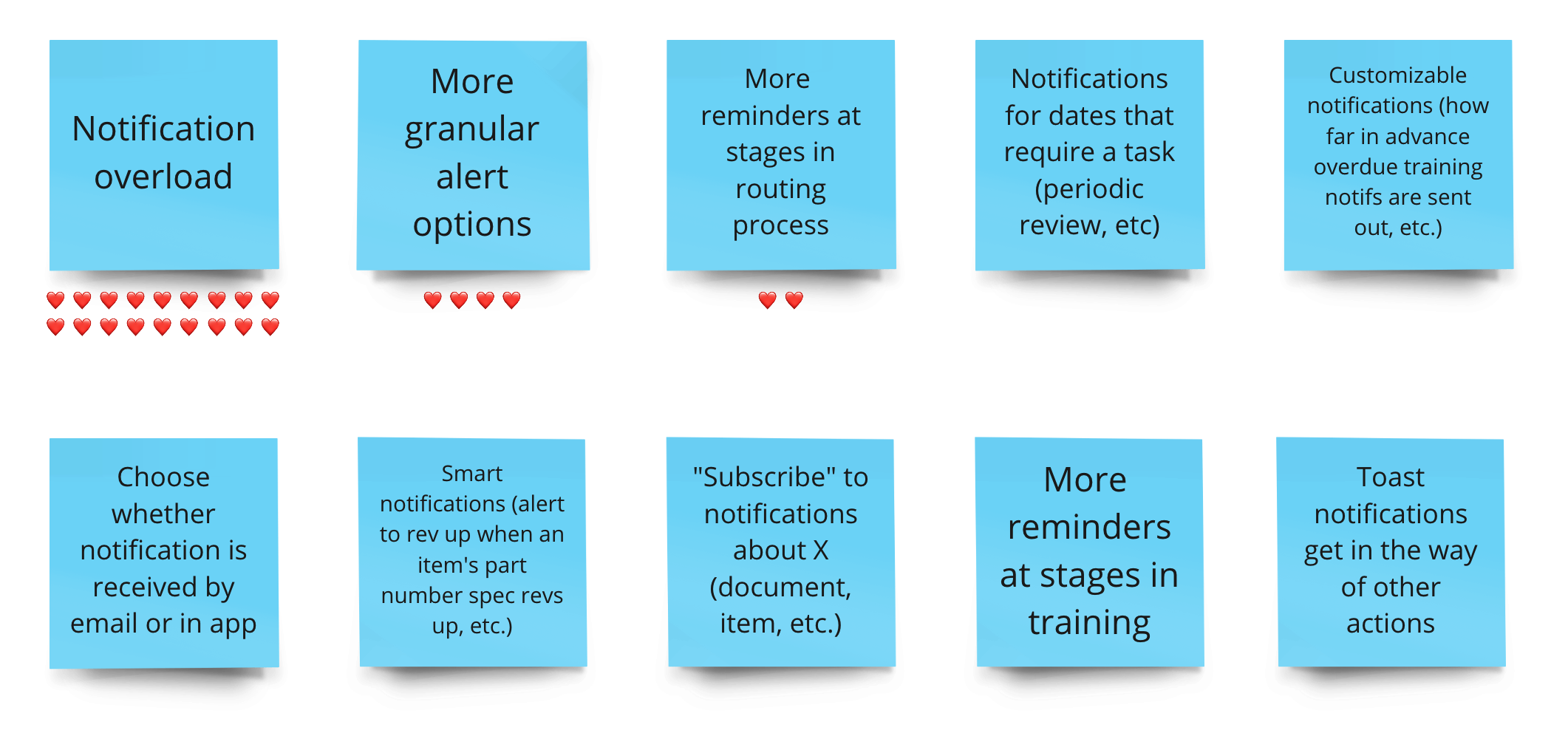
Sticky notes describing the customer feedback we had collected about notifications.
We then interviewed 14 users across 7 companies, from small startups to enterprise-level organizations. Here are some themes we heard over and over again.
Theme 1: OverwhelmUsers were receiving so many notifications that they had to create elaborate email filters to cope.
“I’ve had to create 17 different email filters. What you define as important and what I define as important are very different.”
Inside the app, it was the same story. Every possible event triggered a notification, and there was no way to turn any of them off. Unsurprisingly, the most-used button in the panel was “Dismiss All.”
Theme 2: Not MeaningfulThe lack of granularity meant users were flooded with irrelevant updates. They wanted a clear distinction between actionable and informational notifications.
“I shouldn’t be publishing Jeff’s documents — his team should. I don’t need to be notified about that.”
Theme 3: Creating More WorkWhen important notifications were missed, work stalled. Teams had to manually remind each other through Slack or Teams messages.
“I end up sending Slack messages with all the documents that need approval — just to keep things moving.”
That comment was a lightbulb moment. Users had built entire workarounds outside our product because they had lost trust in the notification system.
Design
With these insights, I explored new ways to give users meaningful control without overwhelming them again.
Early Concepts
Concept 1
Users could opt into specific notifications per module.
Assumption to test: Granular control is good; users want to pick exactly what matters to them the most.

This first concept breaks out the most important notifications by modules. Click here to see the full page with all modules.
Concept 2
Notifications were grouped into categories (e.g., “status updates,” “routing activity”).
Assumption to test: Users prefer simpler groupings with optional deeper control.
This second concept groups notifications, then separates them by modules. Click here to see the full page with all modules.
When we tested these ideas, users were... overwhelmed again. Even though some appreciated the flexibility, most felt paralyzed by the number of choices. We realized that users wanted control, but not the responsibility of managing it.
Iterations
Next, I explored ways to emphasize relevance over granularity, focusing on notifications tied to each user’s responsibilities, with additional options available for power users.
After multiple iterations, we landed on a design that allowed users to:
- Start with meaningful defaults (based on their role and context)
- Expand into more granular controls when needed
- See at a glance what they were subscribed to across all workspaces
This concept highlights the most important information to all users at the top - mainly, what they are responsible for taking action on. Below that, Administrators can control an additional set of notifications. The final section is for the customers who wanted a very in depth overview of everything going on in the system, or just a couple specific things that they are in charge of. This concept gives the most flexibility and is what we moved forward into usability testing.
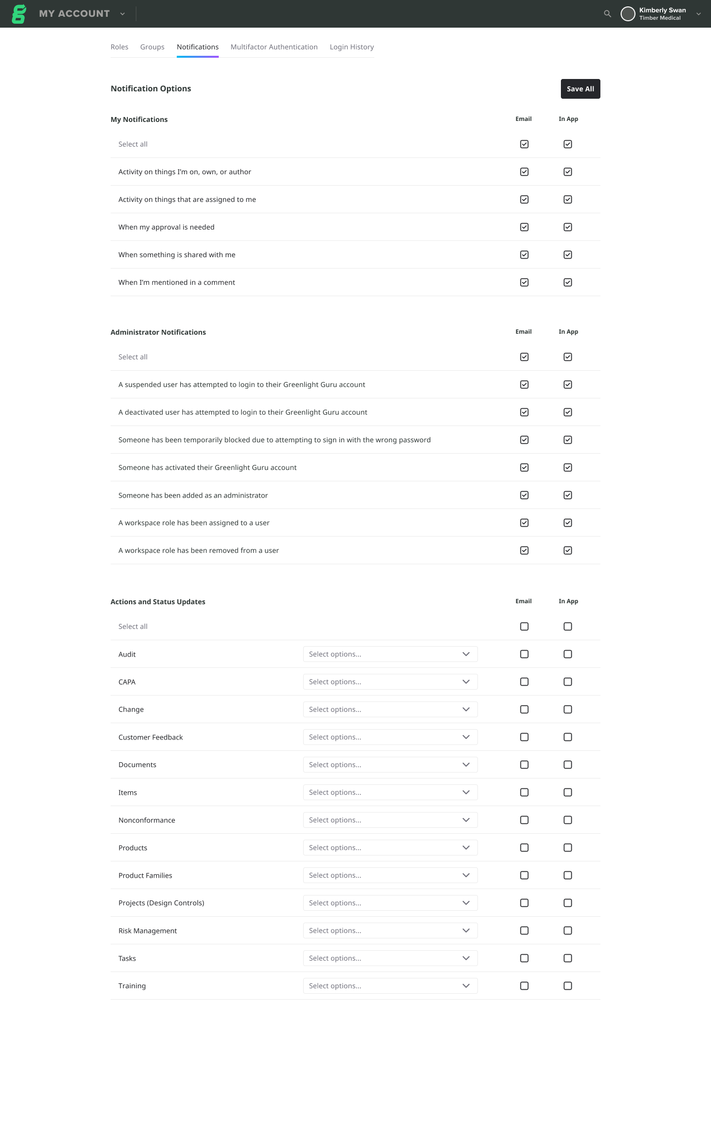
This concept breaks out the important notifications that are relevant to the user into groupings at the top, administrator notifications in the second section, and granular notifications for specific workspaces in the last section.
Usability Testing
To validate the new notification settings experience, we ran a usability study with 20 participants, primarily in Quality and Regulatory roles who use the platform daily or weekly.
Goals
Our goals were to assess whether the new notification organization made sense to users and to identify any patterns or friction points that slowed down task completion.
Key Findings
- 70% rated the ease of updating notifications as 4 or 5 out of 5.
- The overall organization of notifications felt logical and intuitive.
- Dropdown menus were sometimes overwhelming, and several status options were unclear.
- Users wanted better clarity on what notifications were specific to them vs. global updates.
Important Insights
- Most participants successfully completed all tasks and found the save flow straightforward.
- Some users expected dropdown selections to auto-check notification options.
- Participants appreciated the flexibility but suggested letting admins set default notification templates to reduce setup time.
Improvements
We refined copy and hierarchy, added brief descriptions for key sections, clarified “My” vs. “Global” notifications, and planned to auto-select notification channels after dropdown selections were made.
Implementation & Impact
As the design evolved, I worked closely with engineering to ensure a smooth rollout. Untangling the old notification logic took time - we discovered layers of “spaghetti code” and even had to migrate to a new notification service before launch, but the effort paid off.
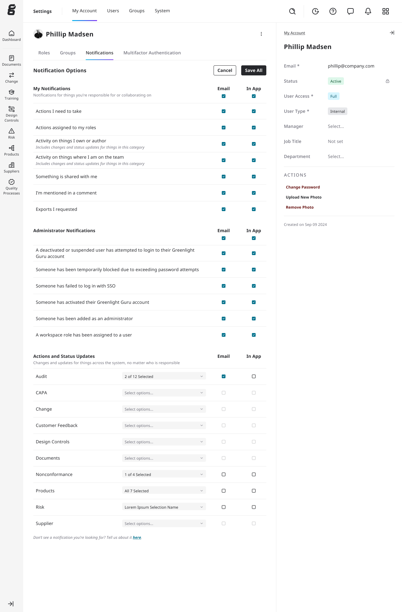
The final design - showing the same three sections with more descriptions where users had the most confusion.
Results
🎯 Opt-out rate reduced from 90% → 44%.
Not quite our goal, but a huge improvement in engagement and trust.📈
Performance significantly improved for large organizations, thanks to fewer notifications being generated.💬 Customer feedback turned positive.
Users reported receiving fewer irrelevant emails and missing fewer important updates.
After making these changes, one customer said:
“I can finally trust that the notifications I get actually matter.”
What We Learned
Even with major improvements, some challenges remain:
- Some notification groupings are still too broad. We’re monitoring which ones users disable most and following up to understand why.
- Large organizations want more administrative control over what their employees can opt out of.
- Email volume is still high overall. Future projects will focus on smarter batching and reducing redundant notifications.
This project succeeded because we listened deeply and tested thoroughly. By grounding our design decisions in user research and iterative testing, we rebuilt not just a notification system, but user trust in the product itself.
More Case Studies
Complex Problem • Testing
Flexible Permissions
Redesigned a rigid, role-based permissions system into a flexible, scalable experience - grounded in user research and validated through usability testing.
AI • Innovation
AI Assisted Risk Search
Brought AI into a regulated workflow, helping users find FDA codes and risks instantly.