Flexible Permissions
As part of Greenlight Guru’s quality management software, permissions are critical for ensuring the right people have the right level of access, especially in the highly regulated medical device industry. However, our existing permissions model had grown increasingly complex over time, creating confusion and rigidity for our customers.
My role: Design Lead, Research Lead
Team: Design + Product Manager + Staff Engineer
The Problem
Over the years, our app’s permission model had become unwieldy. It was entirely role-based, meaning each role came with a fixed set of permissions. As new modules were added, new roles were created, eventually totaling 42 roles.
This model created several challenges:
- Lack of clarity: Customers struggled to understand what each role actually allowed.
- Rigidity: Roles were not customizable, so organizations often had to over- or under-permission users.
- Scalability issues: Each new product feature required adding or editing roles, compounding the complexity.
Users frequently had to refer to documentation or support when adding new users, which slowed onboarding and created frustration.
The Opportunity
Existing customer feedback made it clear - permissions were one of the most confusing and time-consuming aspects of using our system. Improving this experience was a huge opportunity to:
- Simplify training and onboarding for new users
- Enable flexibility for organizations to tailor access
- Build a scalable foundation for internal growth
- Support customer retention, $2.2M ARR of accounts had flagged this as a pain point
- Unlock pricing flexibility by introducing more nuanced user levels
Discovery, Part 1
To start, we needed to understand how customers were currently managing roles and where things broke down. We interviewed 16 customers across key segments and ran an in-app micro-survey looking to understand:
- How easy is it to understand what each role allows?
- Does the current model meet your needs for control and visibility?
We heard a lot of things like:
“There are so many different roles and their purpose & capabilities are not clear.”
“We need the ability to create custom roles that align with how our company actually works.”
Key Themes
After categorizing all the feedback we recieved, it boiled down into a handful of themes:
- Confusion over what roles mean
- Too much or too little access for certain users
- Desire for more granular control and customization
- Frustration during audits due to unclear access visibility
These conversations revealed the underlying tension: our customers needed both control and simplicity.
Quick Win!
While we knew a full redesign would be a long-term effort, we identified an immediate improvement: providing view-only access for the Quality Processes modules.
This was one of the top recurring requests, and implementing it early allowed teams to stay informed without compromising data integrity.
We have gotten tons of positive feedback from customers on this change in the few months it has been available.
Discovery, Part 2
In a second round, we talked to 13 more customers to dig deeper into two questions:
- What’s the right level of granularity?
- Where should we draw boundaries between user levels?
This round, we heard a little more around the user levels:
“Light licenses should carry a little more visibility.”
“I have to use a workaround just to assign a real document owner.”
“There’s a huge disconnect between light and full users.”
Key Themes
The themes this round didn't look totally different from the first, but they had a little more context:
- Customers wanted customizable access with granular visibility
- Need to inherit permissions for easy bulk assignment
- A strong desire for three clear access levels: View-only or “light” access, Edit access, and Admin-level management rights
To validate these insights, we ran a survey that confirmed most customers mentally organized access in three tiers, an important anchor for future design.
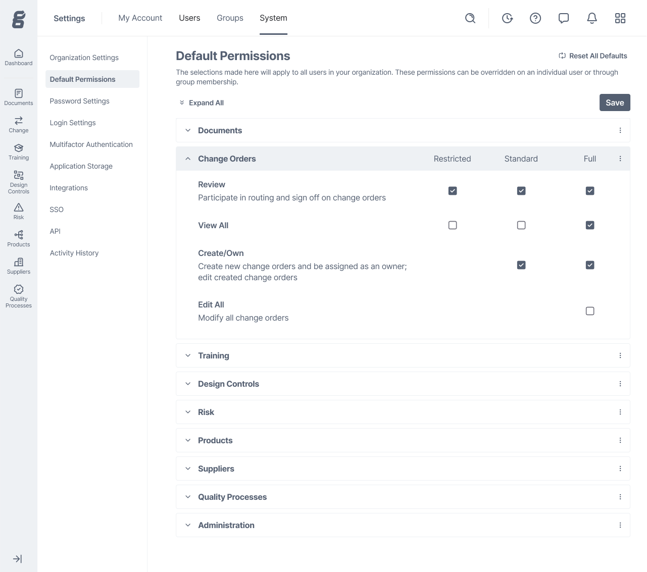
Design
I designed early wireframes to explore two key functions:
- Default permissions: Admins could set default permissions for each user level.
- User/group assignments: Permissions could be managed for individuals or groups.
Early Concepts
Concept 1
A dropdown heavy layout - although this was efficient with space, hiding the permissions behind dropdowns kept people from seeing the big picture of their notification defaults easily.
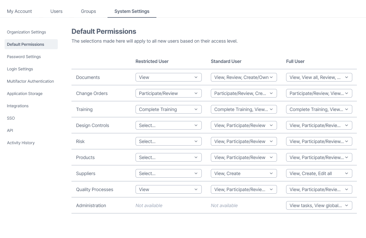
This first concept shows all modules across the app with permission dropdown options for three user levels.
Concept 2
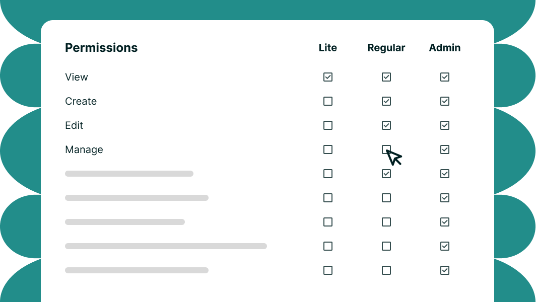
A checkbox heavy design - this got us closer to seeing the big picture, but was overwhelming and redundant.
This second concept shows all modules in the app and permissions listed as checkboxes for each of the three user levels.
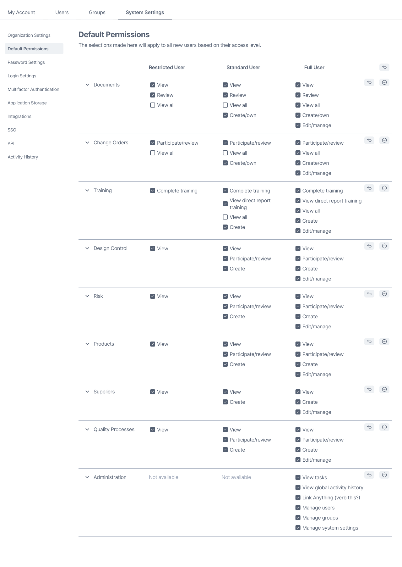
Concept 3
This is the design that made it to testing - by prioritizing the permissions that are available in each module, but listing them on the left, we could be descriptive, give people a holistic view of everything they have enabled, and allow them to collapse anything that's not important in the moment.
This third concept shows all modules in the app and lists permissions for each, with checkboxes for each of the three user levels.
Usability Testing
To validate our final concept, we ran an unmoderated usability test with 18 participants. We gave them four tasks to cover each use case.
Tasks & Goals
Task 1 Goal:
Adjust default organization permissions (79% positive)
Some users got stuck on how permissions work now, but once understood, they moved through confidently
Task 2 Goal:
Assign permissions to an individual (78% positive)
Very quick and intuitive, “LOVE THE GRANULARITY”
Task 3 Goal:
Upgrade user access level (86% positive)
Smooth and self-explanatory; tooltips helped when the permission was not available at the current user access level
Task 4 Goal:
Add permissions to a group (76% positive)
Clear overall, though users wanted faster ways to confirm individual permissions
Overall Takeaways
The test was overall very successful and it gave us confidence to move forward. We confirmed that:
- Defaults made sense and aligned with expectations
- Changing permissions and access types was easy and intuitive
- Group management needed small refinements for visibility
Next Steps
We moved into a proof of concept phase to validate the technical feasibility of reworking permissions. The engineering team confirmed it was possible, though it would require significant effort.
Before development began, leadership made the call to pause the project. The company had just acquired two new organizations and needed to reprioritize the roadmap.
What We Learned
Although development is on hold, our work has built a strong foundation:
- We deeply understand user pain points and mental models.
- We validated the usability of a new, flexible permissions model.
- We have tested designs ready for future implementation.
When we revisit this initiative, we’ll be ready to move directly into high-fidelity design and build with confidence.
This project was a reminder of the power of discovery-driven design. Even though we didn’t ship a new permissions model (yet), our research aligned cross-functional teams around a clear vision, one that balances compliance, control, and ease of use.
More Case Studies
Research • collaboration
Configurable Notifications
Redesigned how users manage system notifications, improving ease of use and boosting confidence for Quality and Regulatory teams.
AI • Innovation
AI Assisted Risk Search
Brought AI into a regulated workflow, helping users find FDA codes and risks instantly.